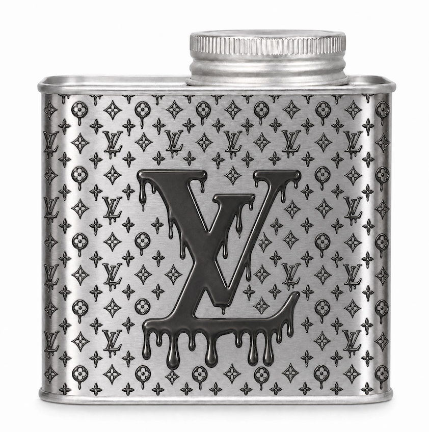
“沾满血的驴”
“Blood-stained LV”
*”We call it a ‘blood-stained LV’—which is a funny pun in Chinese, because ‘LV’ sounds like the word for donkey (驴).”
In an era where everything is forced into a sterile, cookie-cutter “aesthetic,” the visual language of specialty coffee has fallen into a boring, predictable routine.
We got tired of it. So, we stopped pretending.
Breaking the Noise
We didn’t set out to make another polite, minimalist tin that whispers to the mainstream. We wanted something that bites back—a piece of industrial rebellion that directly challenges the hollow, hyper-capitalized norms of modern luxury.
Some called it provocative. We call it an awakening.
Aesthetics are for breaking the noise. But style without substance is just empty noise.
Expertise as the Baseline
While the visuals are designed to turn heads and provoke a reaction, what is inside the tin is backed by uncompromising discipline. Behind the raw exterior lies rigorous professional standards—backed by Q-Grader expertise, obsessive micro-lot and competition-grade sourcing, and a relentless pursuit of the cup.
We don’t care about pleasing everyone. We care about the ones who actually taste the difference.
The Antithesis
This era doesn’t need another follower playing it safe in the middle.
We are not here to fit in. We are here to be the heretics.